Fox Summit
Tools used
Could we inspire you with our work?
Tell us briefly and crisply about your project. It doesn't matter if you only have a rough idea or a polished concept. We look forward to your inquiry and then let's talk!
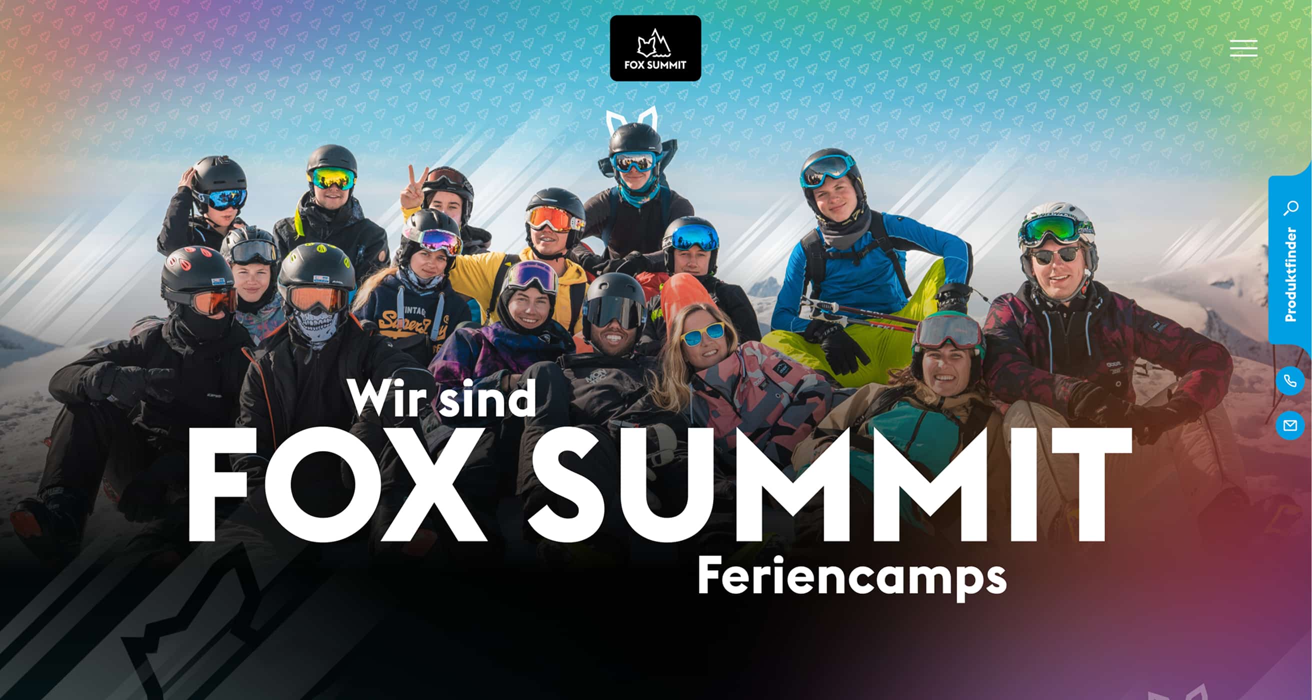
Action-packed web design for a young target group:
Fox Summit shows how digitally powerful vacation camps can be today.
When Fox Summit contacted us, it quickly became clear that the previous website was not a flagship, but merely a redirection. A static landing page without any real content, but with a redirect to the booking platform. More signpost than experience. It was developed by internal development teams who are primarily responsible for the technical booking system. Visually not completely out of place, but without user experience.
What was missing was everything that makes a brand tangible. No introduction, no approach, no feeling for what Fox Summit actually means. Our task was to change that. A stopover became an experience area, bold, emotional, structured.
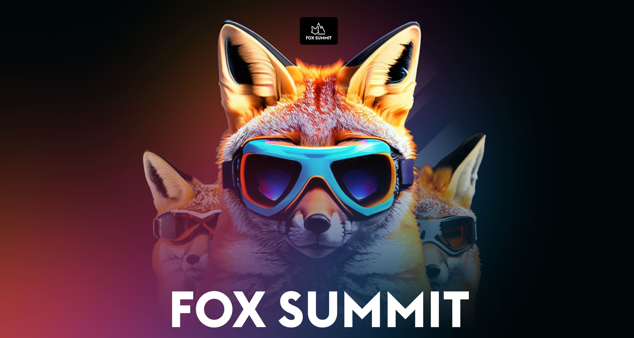
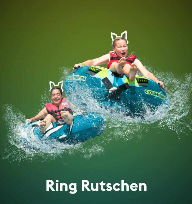
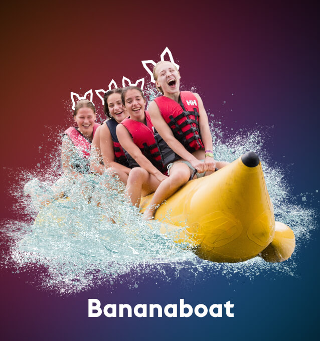
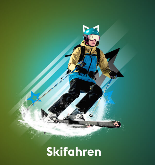
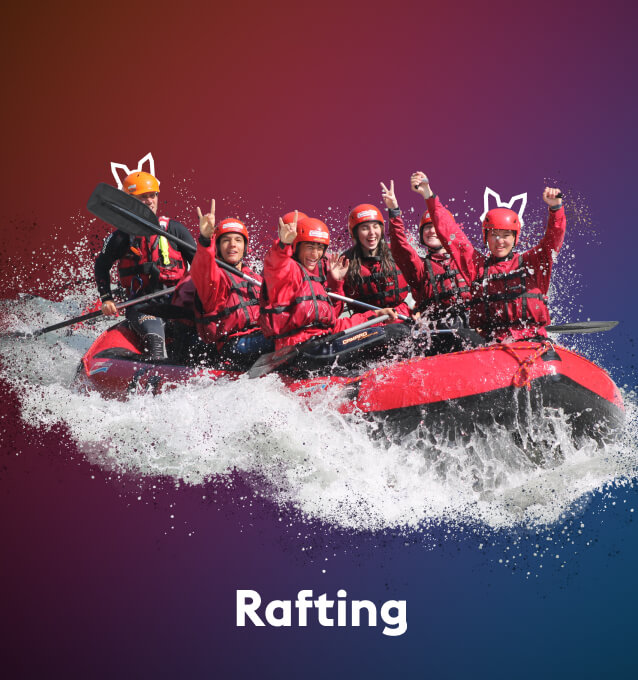
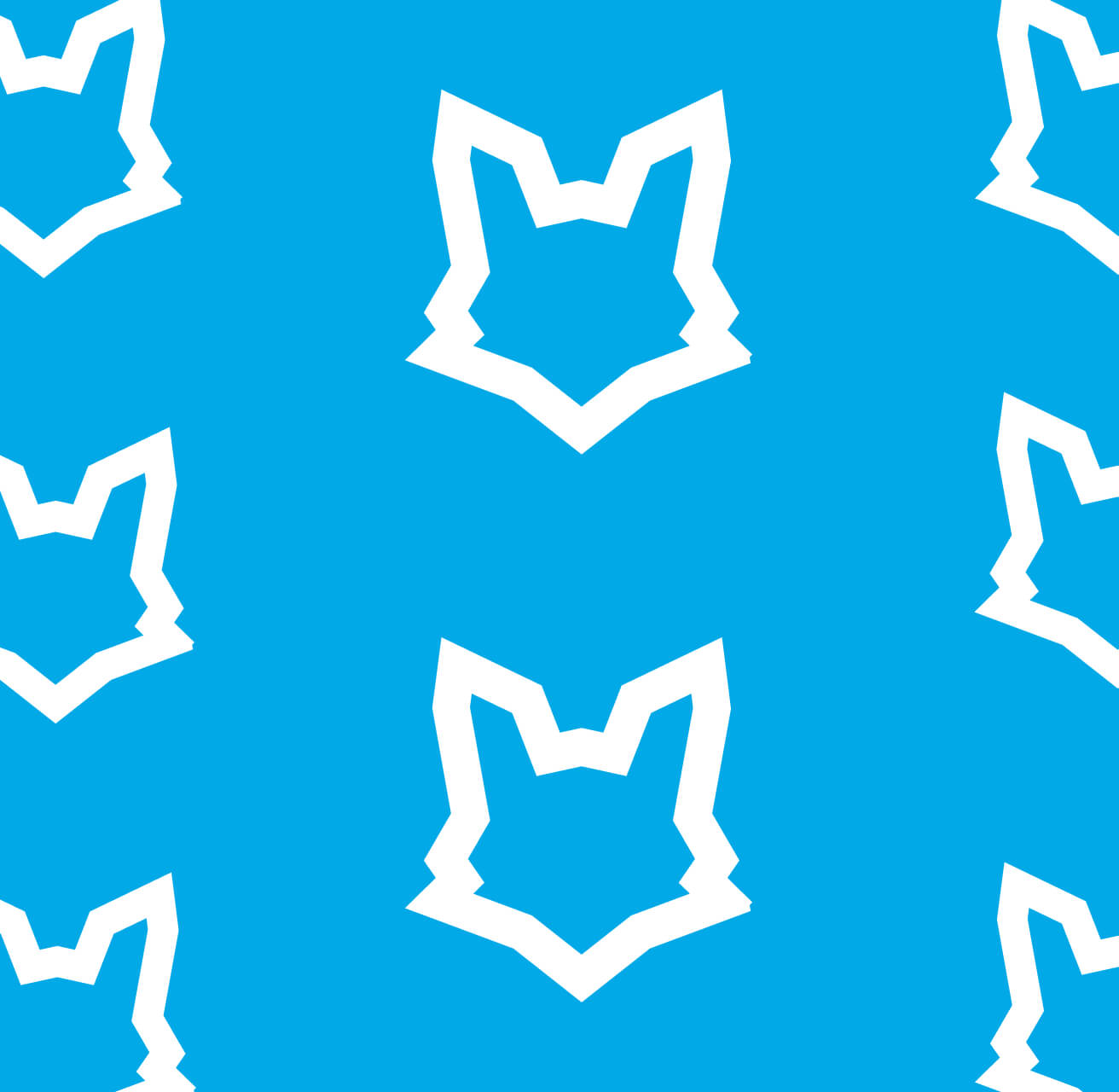
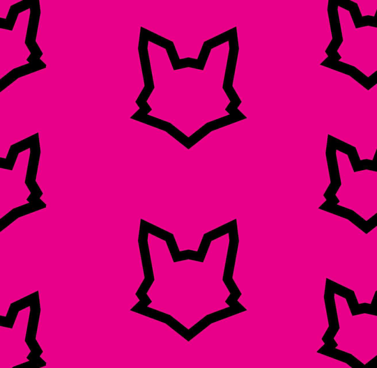
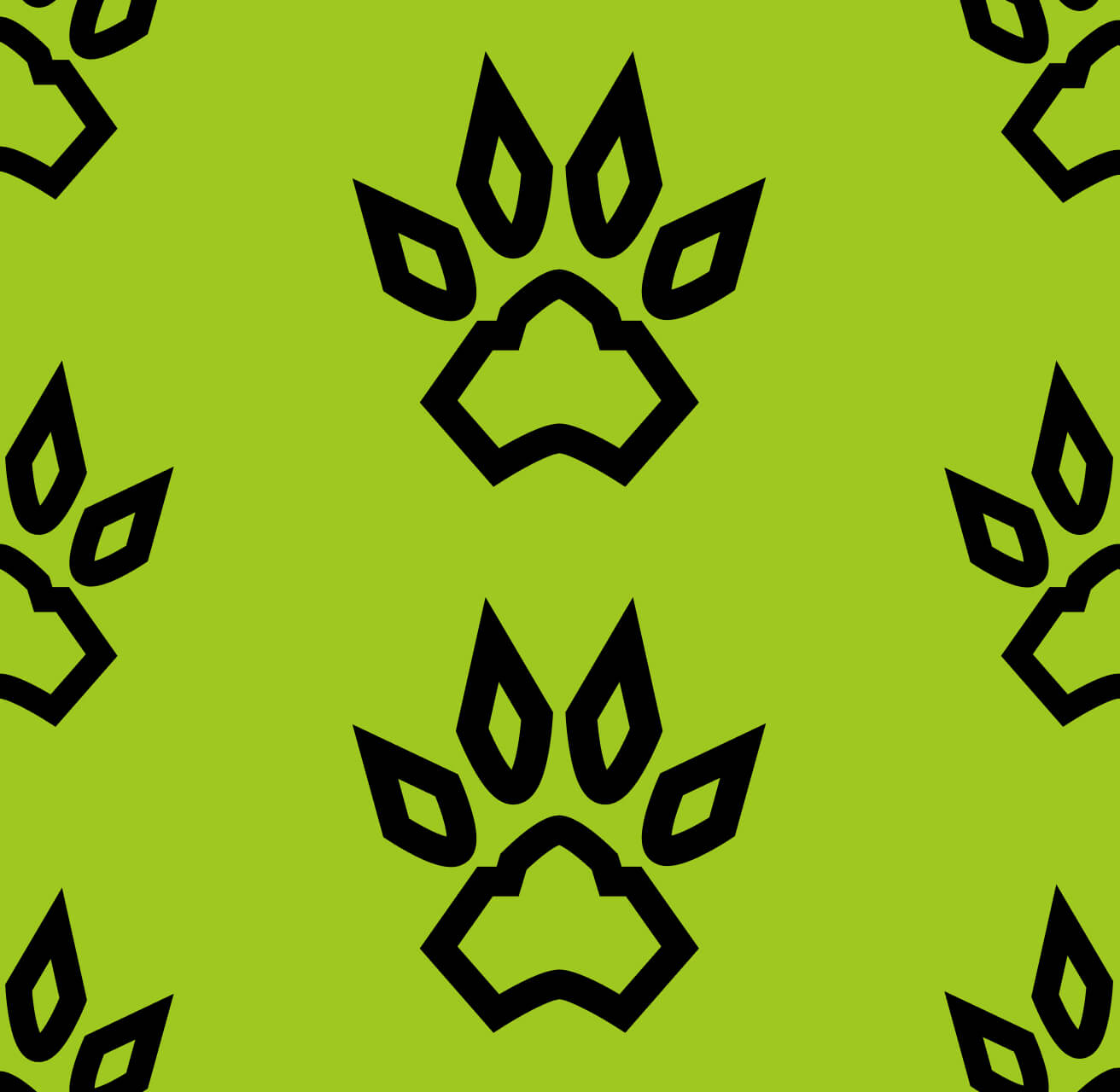
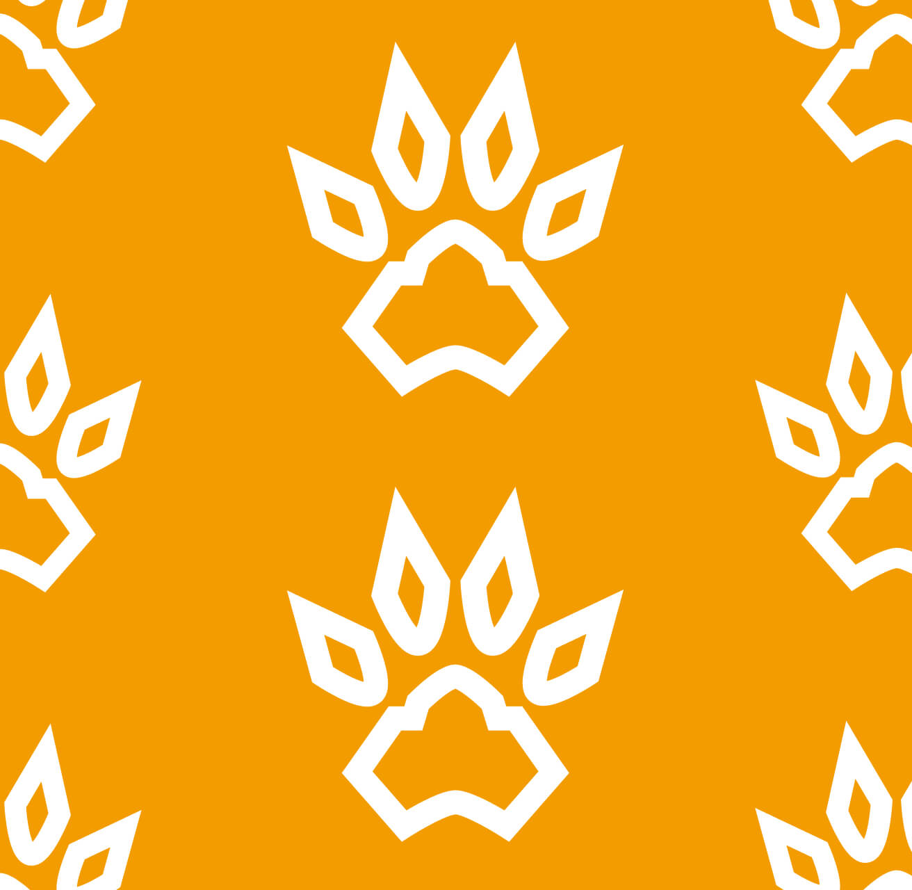
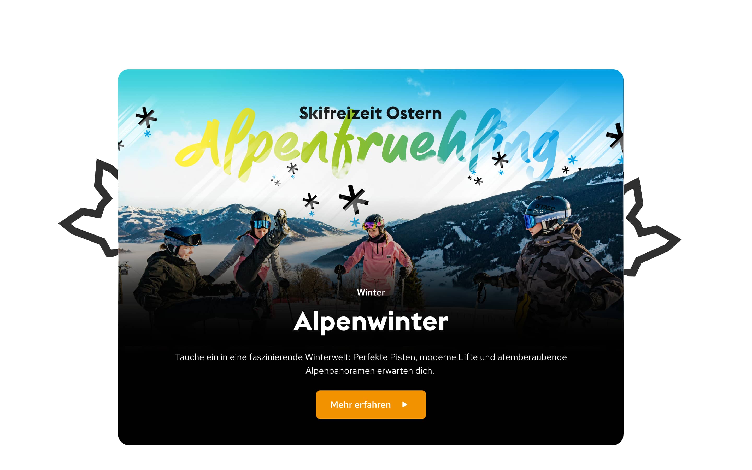
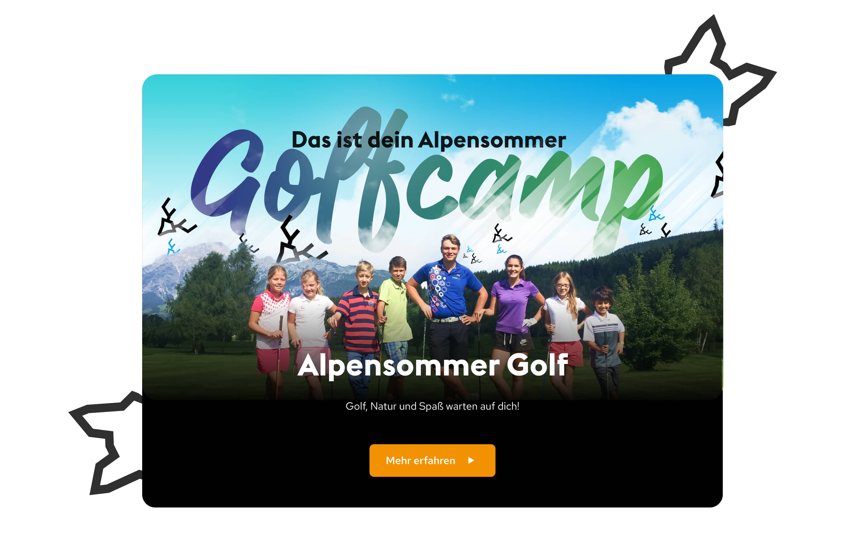
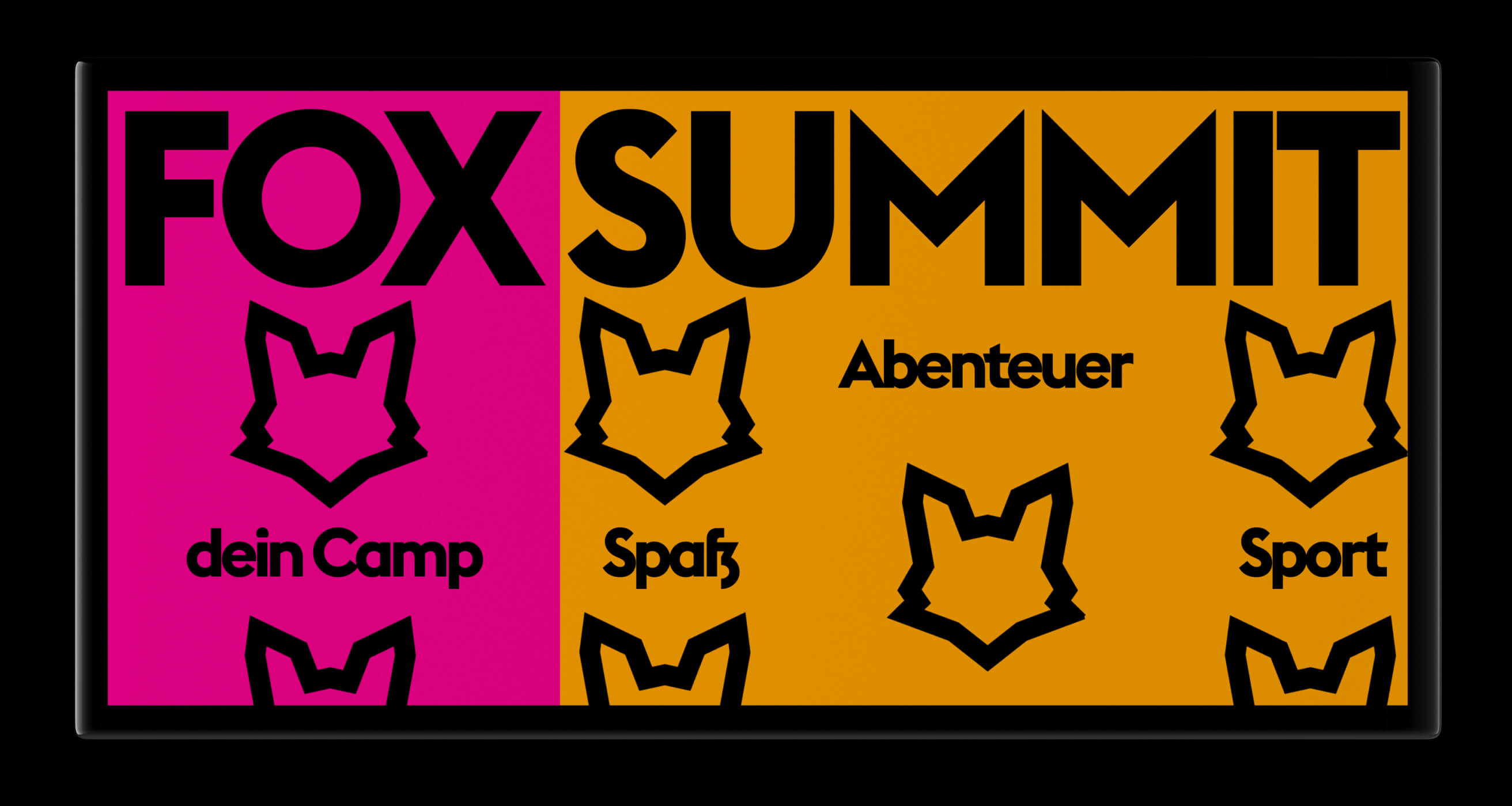
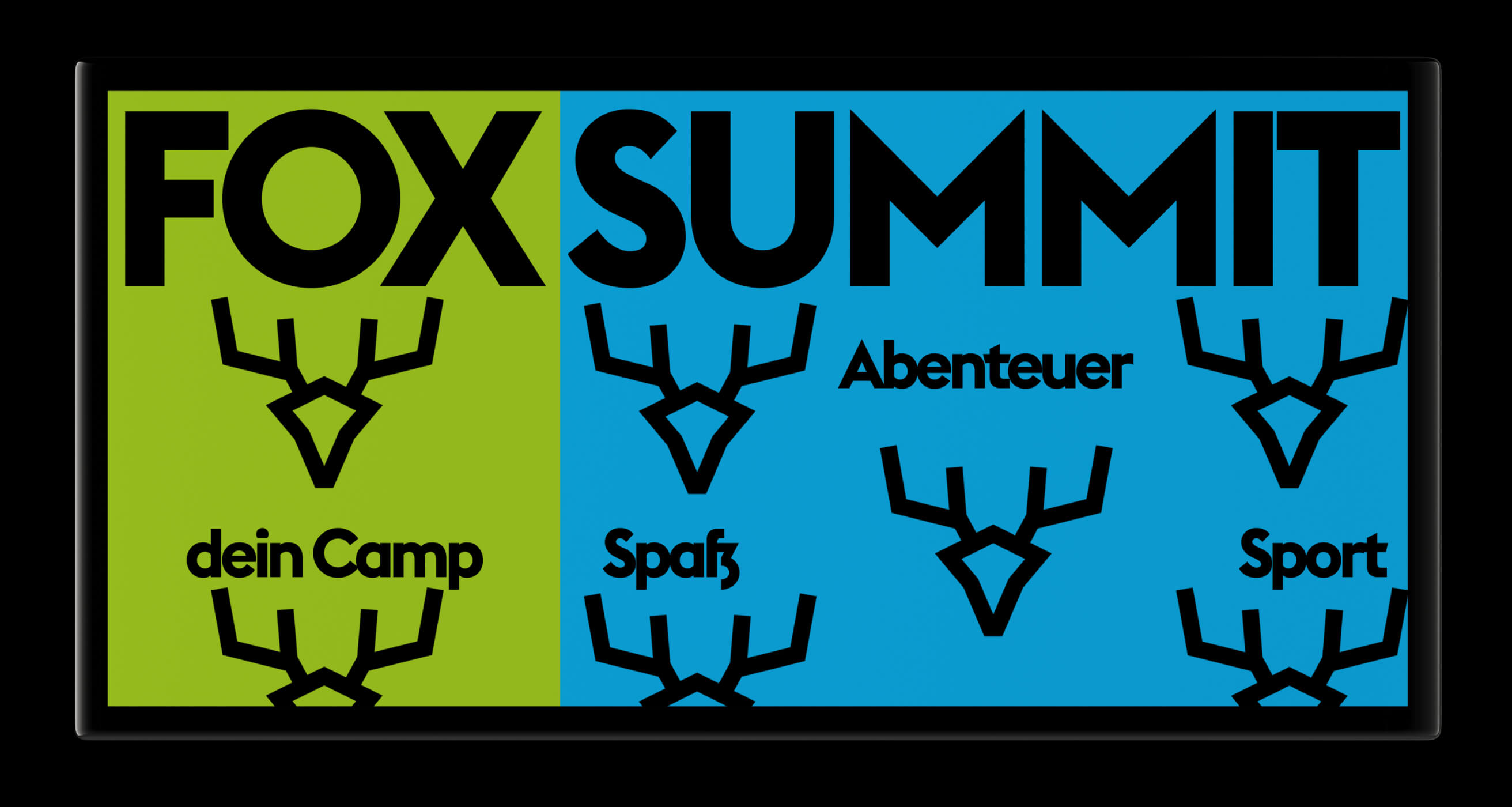
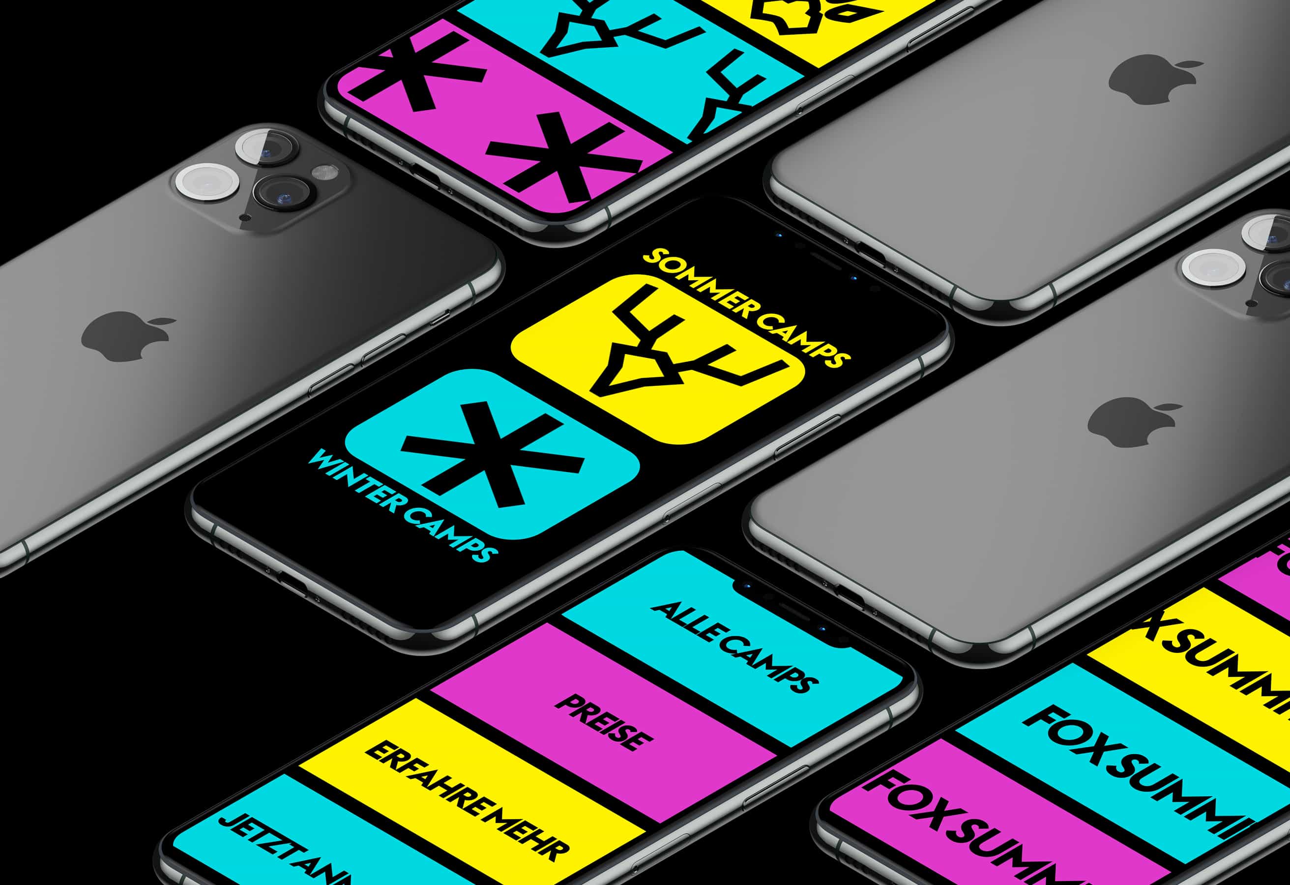
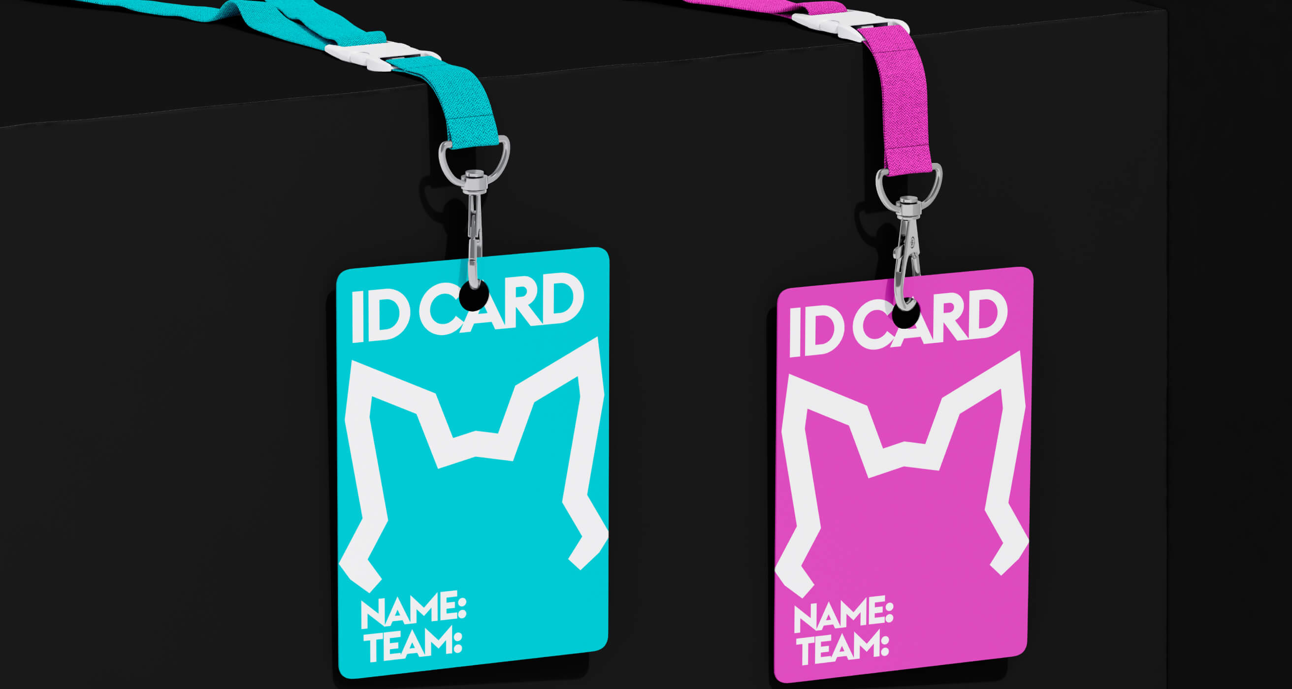
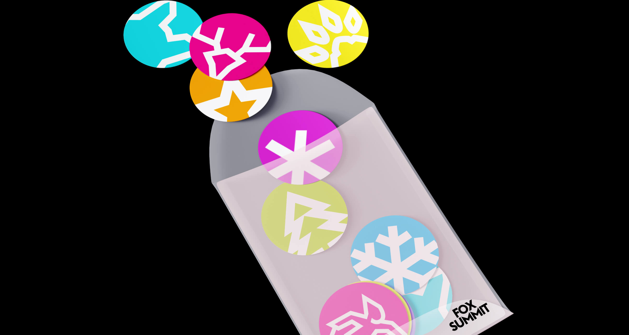
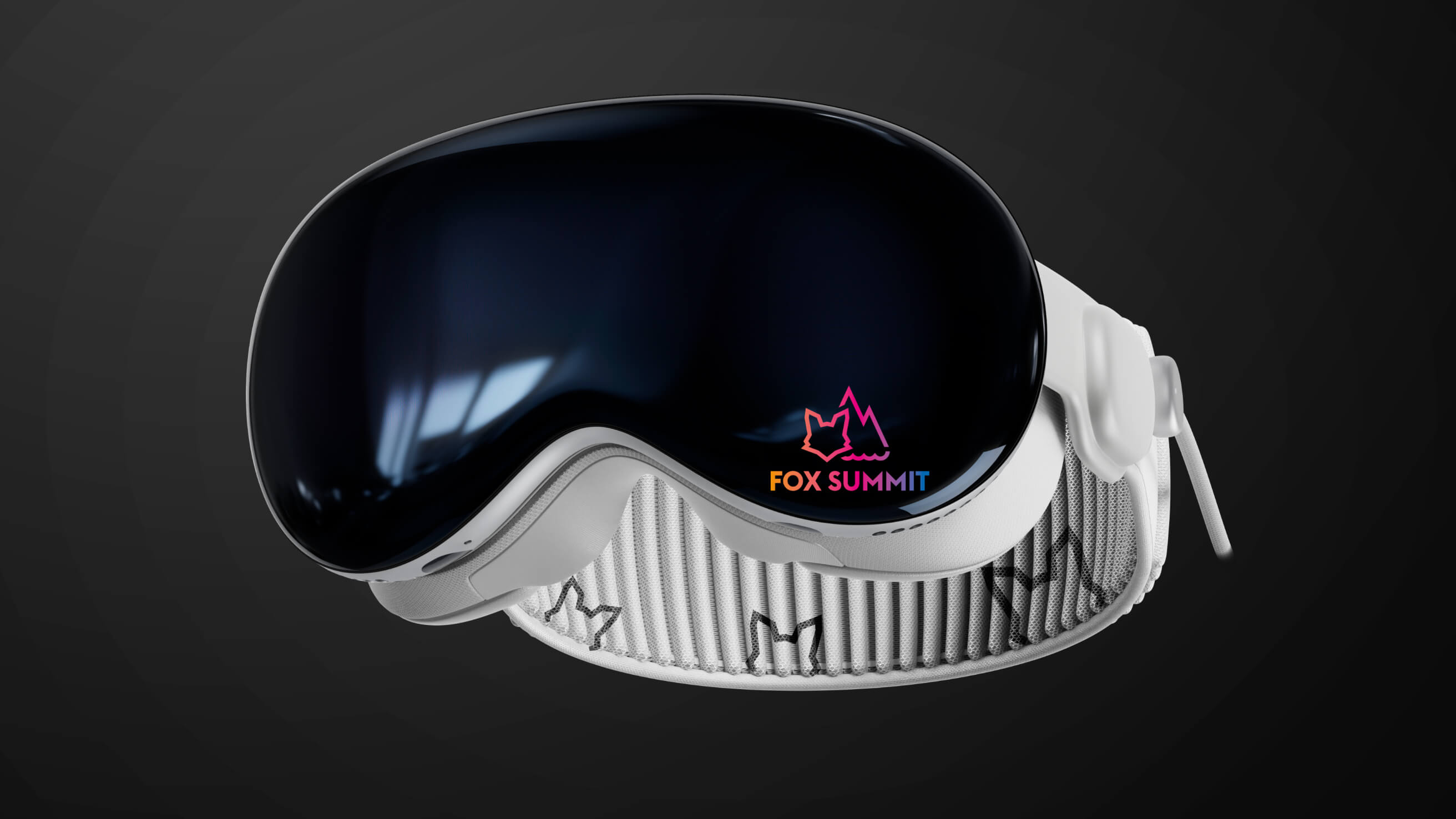
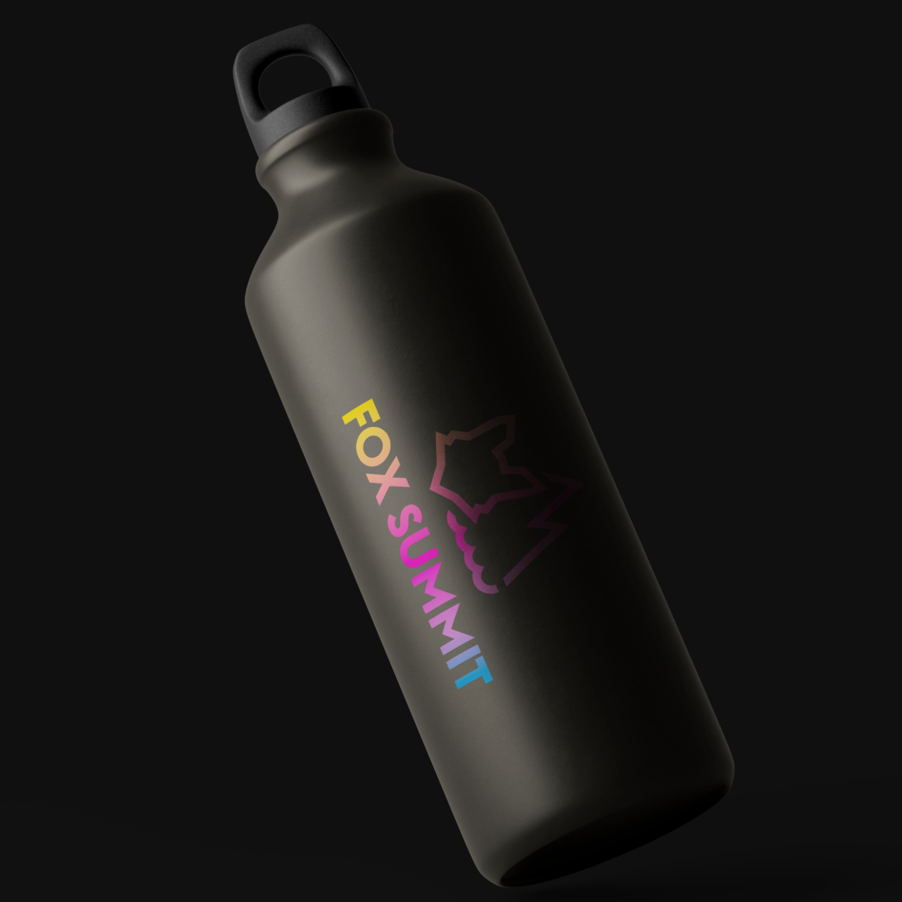
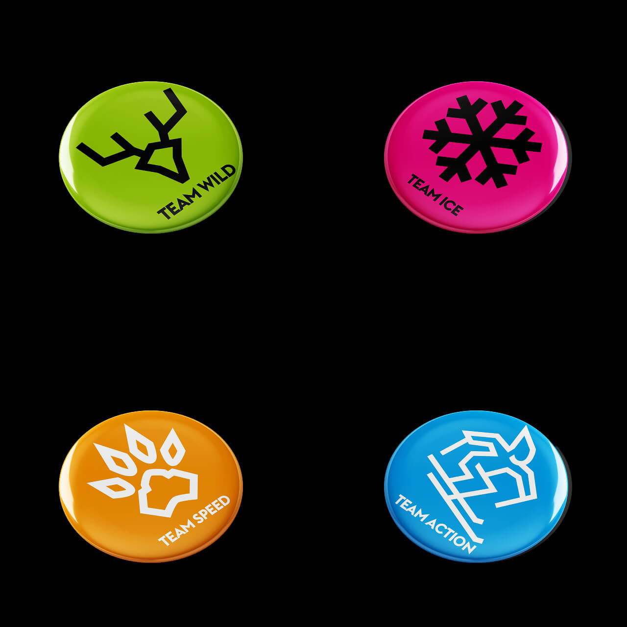
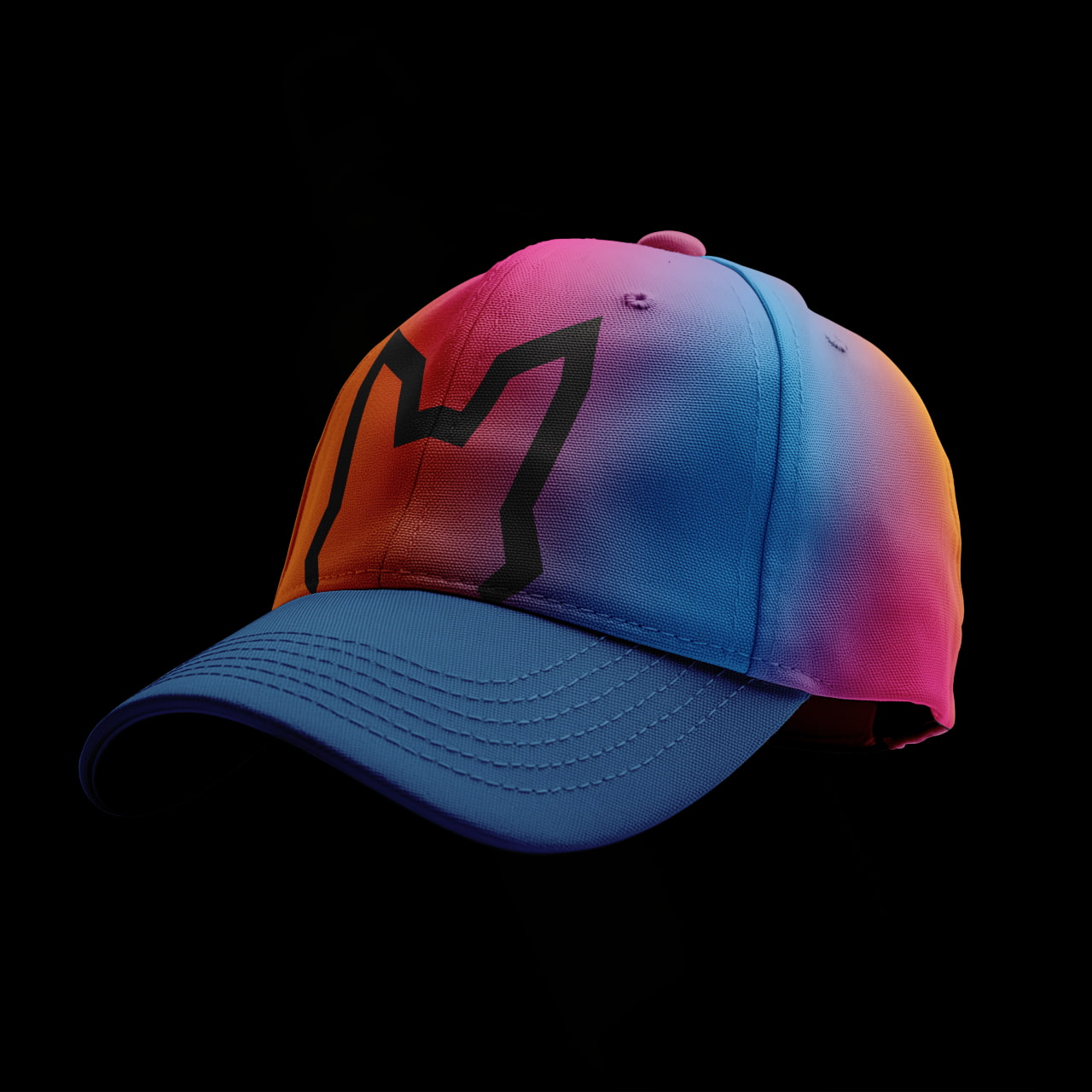
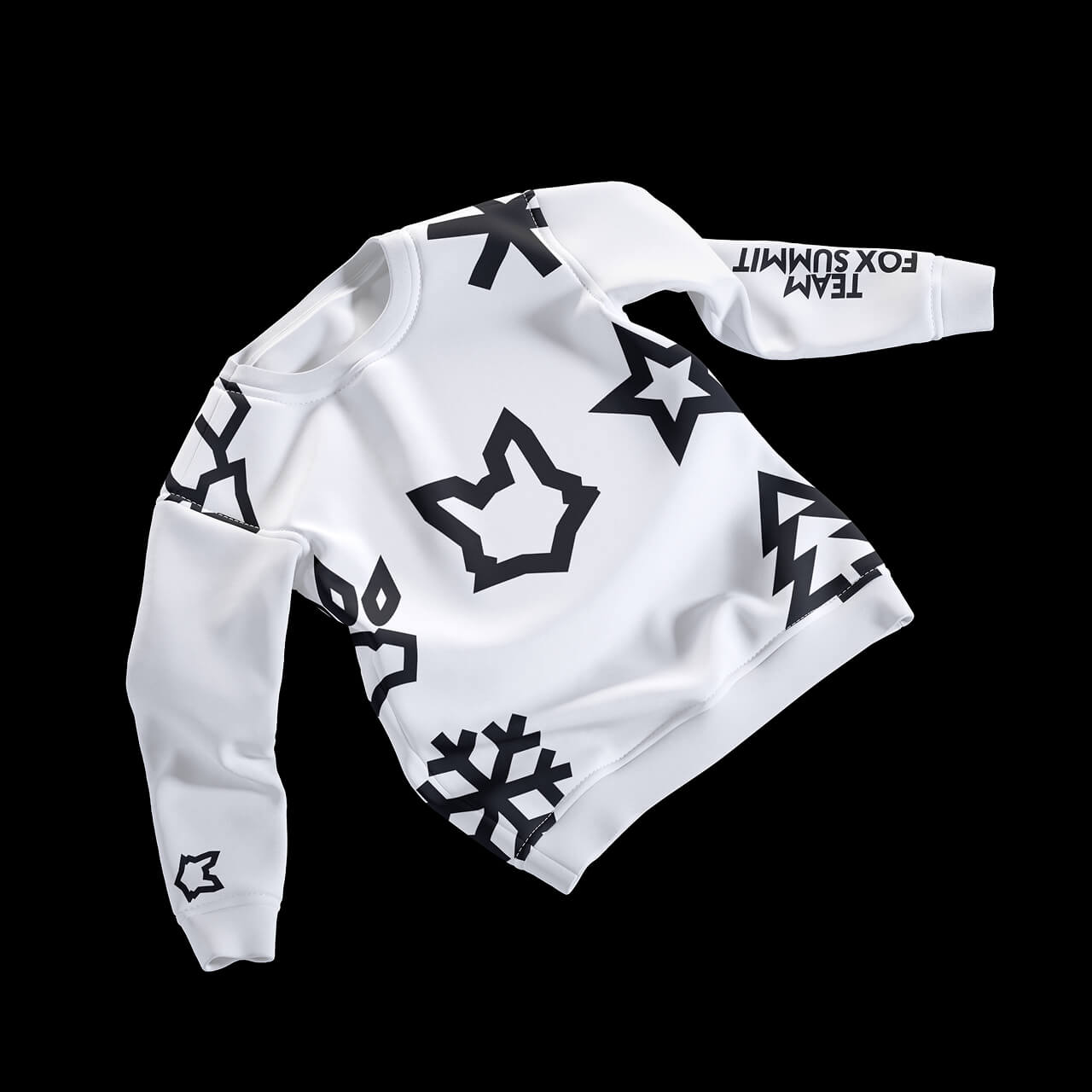
The creative start came from the icons. From the abstracted fox head in the logo, we developed a visual system that gradually became the basis of the brand communication. The key visuals derived from this, such as the snowflake, deer antlers, fir tree and others, are more than just design elements. They tell stories, structure content and create identification. Each symbol stands for a direction, an experience, a feeling. At the same time, they remain open enough to be used flexibly across all formats.
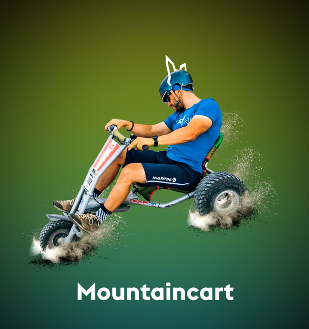
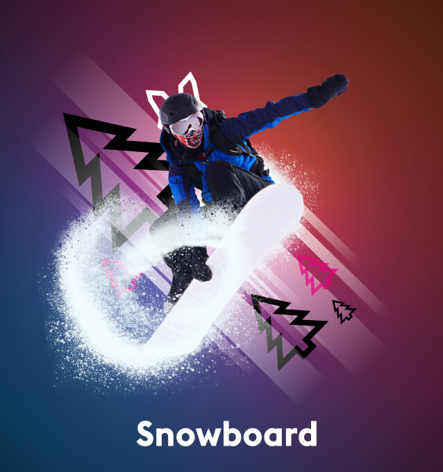
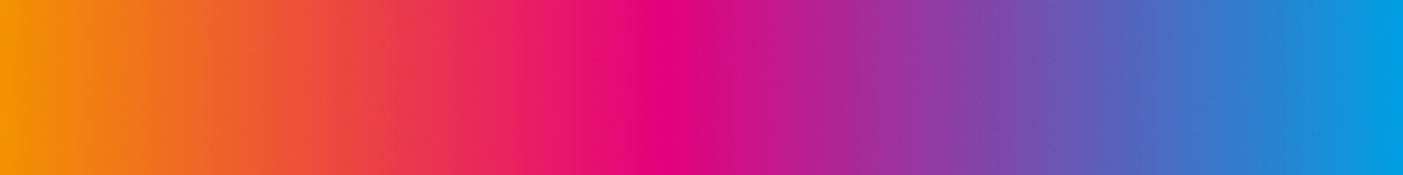
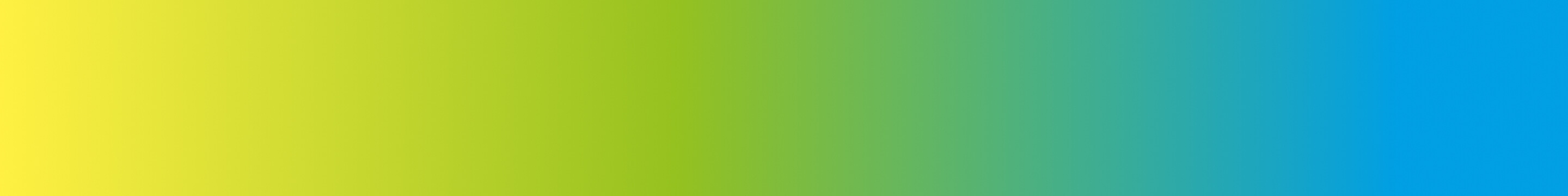
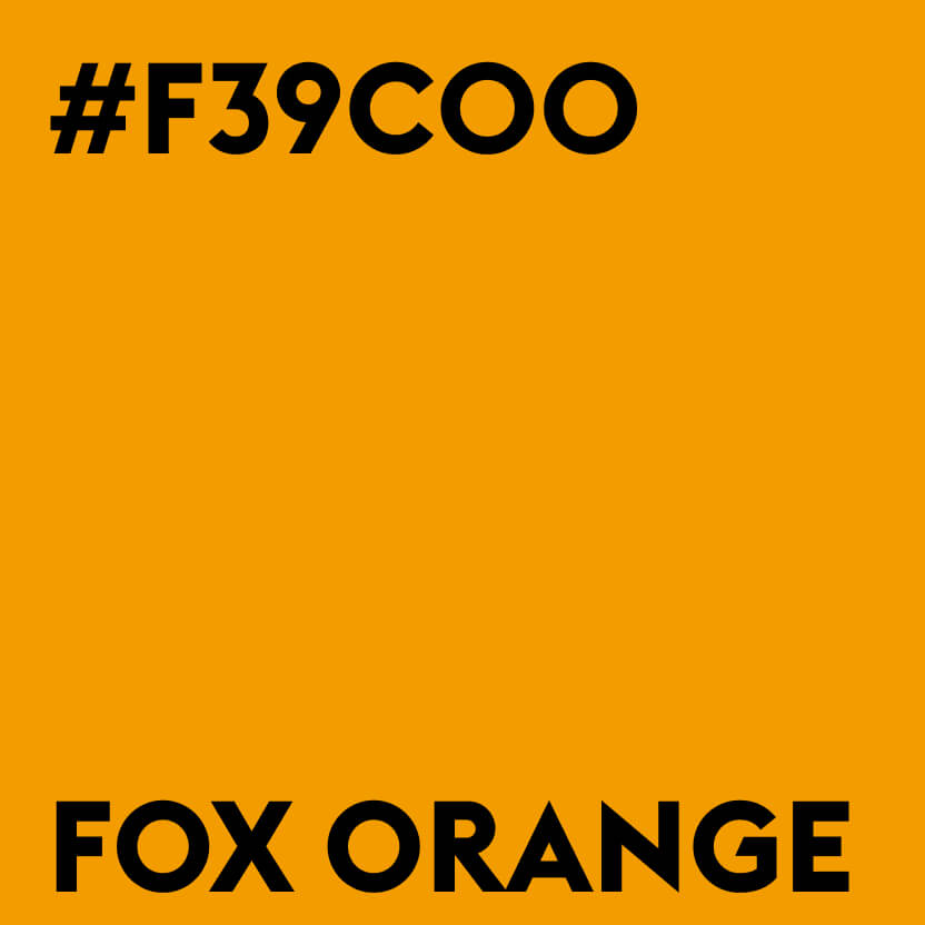
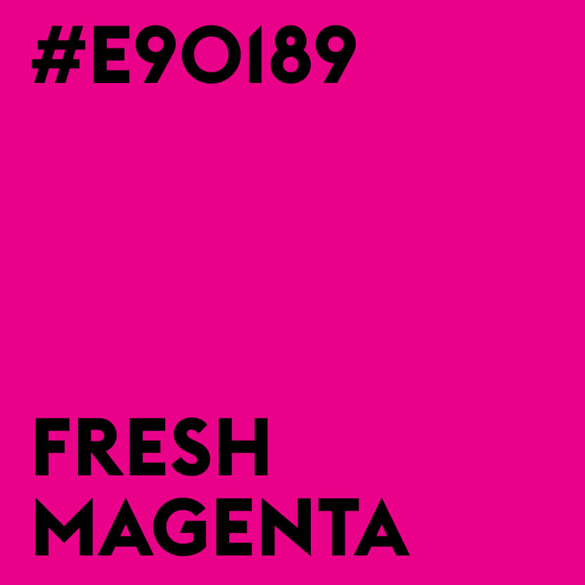
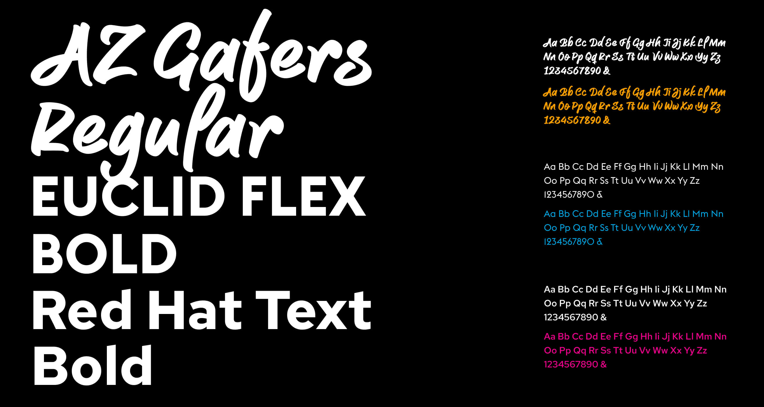
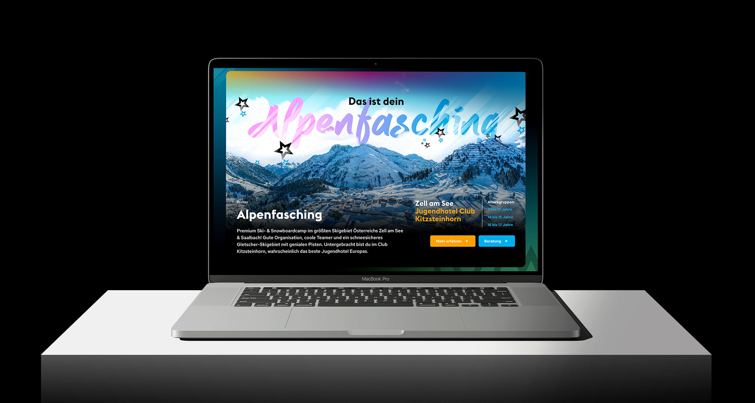
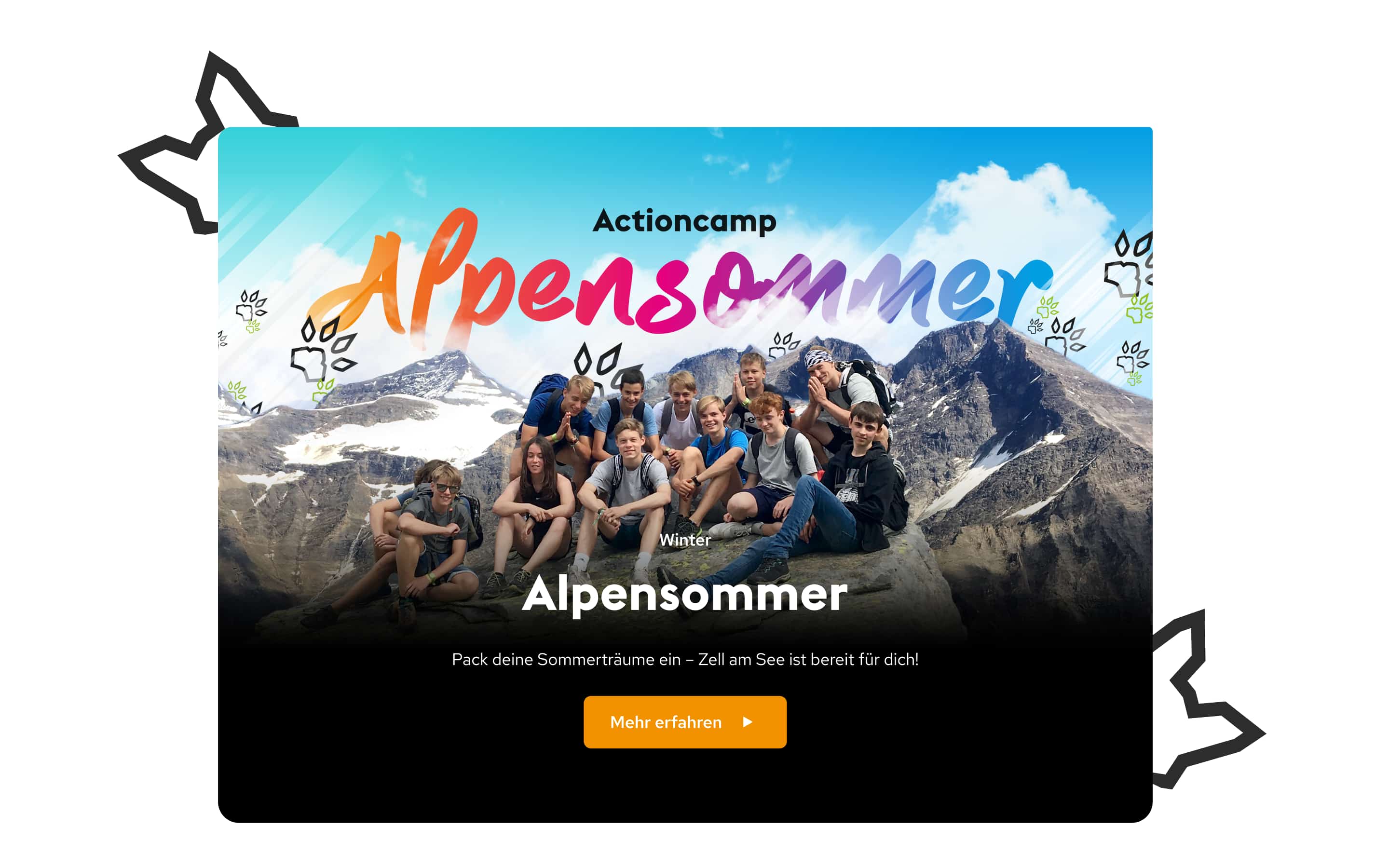
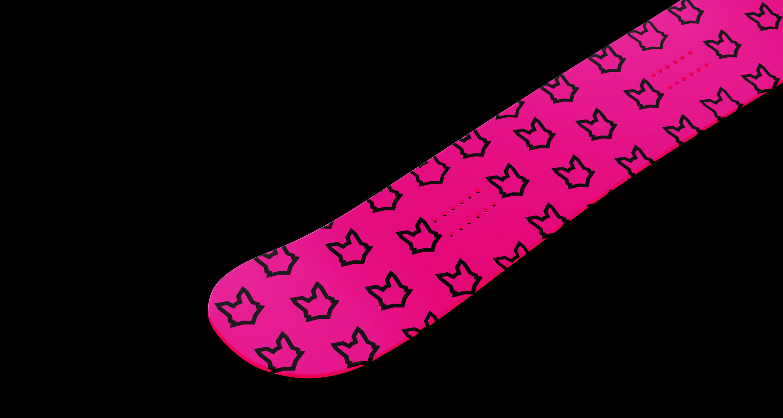
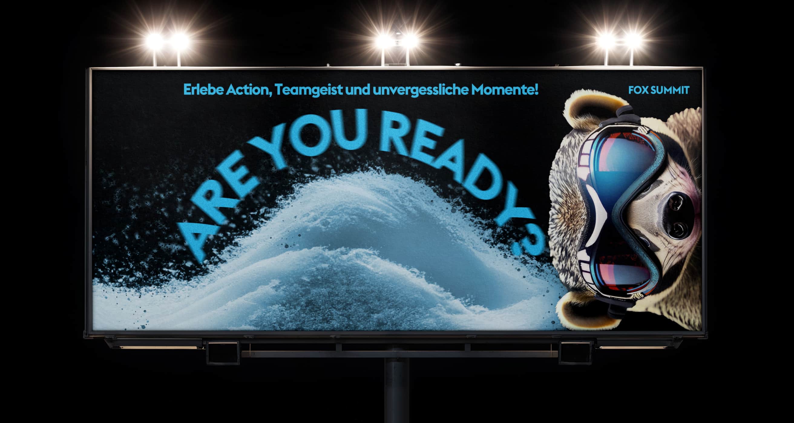
The moment the visual language took shape, it became clear how strongly the design is told through colors. We didn't just define colors, we built a rhythm. Each nuance stands for an impulse, a mood, an attitude to life. The result is a set of tones that screams, flickers and shines without appearing chaotic. Reinforced by linear gradients that transport rather than decorate. Every scroll becomes a movement, every surface a feeling. The typography was a deliberate contrast. While the color world pops, the text world remains focused. A handwriting that never shouts, but shows attitude. Together they create a framework that catches the eye and stands out at the same time. Not rigid, not arbitrary, but just as clear as the page needs it to be.
The images provide the emotional core. We not only defined visual standards, but also actively worked on filling the motifs with life. Snow, water, movement, light. Each image was optimized to bring it to life. Supplemented by specially developed filters and playing with layers, a consistent visual language was created that visually holds together what is thematically diverse.
The result is a digital presence that speaks to its target group and does not have to hide. Fox Summit is not only accessible, it has become visible. Clear in attitude, strong in expression and ready for whatever comes next.